How to improve user experience and wow your users
10 actionable tips from a UX & UI designer
As a digital product creator, you’re probably always obsessing over how to improve user experience. We know because we do too!
And why wouldn't you be?
After all, a great user experience is key to creating a successful digital product. It's what makes users stay, come back, and recommend your product to others.
But where do you start?
With 50+ successful digital projects behind our back, we've decided to put together 10 actionable tips to help you create the best possible user experience for your digital product.
Read on!
UX vs UI
When it comes to digital design, there are two terms that are often used interchangeably: UX and UI. They both refer to aspects of the user interaction, but they actually have quite different meanings.
UX stands for user experience, and it refers to the overall usability of a product. It includes factors like accessibility, emotional appeal, and engagement. UI, on the other hand, stands for user interface, and it is concerned with how a product looks and feels. It includes cosmetic elements like buttons, menus, and layout.
They both play a vital role in creating a successful product. A well-designed UI can make a usable product even more enjoyable to use, while a well-designed UX can make a complicated product more intuitive and easy to use. Ultimately, it’s up to the designer to strike the right balance between UX and UI.
Why is user experience important
First impressions are everything. In fact, you have less than three seconds to make a good impression on your visitors. After that, they're gone.
From a business standpoint, a good user experience can mean the difference between a customer who continues to use your product and one who churns. Frustration usually leads people away from products quickly which would ultimately hurt your bottom line.
From a user's perspective, a good user experience means that they are able to achieve their goals when using your product. They don't get frustrated, they don't encounter errors, and they walk away feeling like they've accomplished something. This can help build loyalty and a repeat customer base.
How to improve user experience on your web app
Source
1. User Research & Testing
The first step to creating a user-centric product is by conducting interviews with potential users and researching similar products on the market. This gives you insight into what your target audience likes, how they use them, and which features are most important for them in determining purchase intent or loyalty.
Once you develop your MVP, user testing allows you to gather insights about usability, functionality and speed by letting real people test it out. But you need enough range of personas!
If only one group is tested then they may not represent all users within an industry which could lead you down a false path and result in low conversion rates and usability issues, both significantly more expensive to fix once your product has launched.
Testing across different groups like gender, age and background will allow you to discover what type of behaviour or traits are unique or what can be generalised to improve your design.
2. Responsiveness
With mobile becoming more prevalent, consumers expect to be able to access content anytime, anywhere. That's why responsiveness is so important: it means that no matter how big or small their screen is (desktop, mobile, or tablet), everyone will get an aesthetically pleasing interface with all content clearly visible.
Consider adopting a mobile-first approach as it’s easier to build a mobile version of your product first and then adapt it to fit larger screens.
You should also design around the content instead of a certain screen dimension. New devices are constantly flooding the market so it’s better to optimise to show the most important content according to the goal of the page.
3. Consistency & Predictability
In order to create a user experience that is both intuitive and comfortable, you must be able to adapt existing UX/UI standards and established patterns for your product.
Users have certain expectations for how elements behave. You should make sure that they can easily understand and interact with your product. Being able to foresee the outcome of an interaction will result in a more predictable experience with less confusion or frustration on their part.
To make your web app look and feel more polished use consistent patterns and reusable components. Stick to similar colours, padding and thicknesses to make all elements on a page coherent, making it easier for users to navigate through the system.
4. Legible Typography
When it comes to making your web app accessible for all users, font size and type are key players. Make sure there's enough distinction between one letter from another so people can easily read what they're clicking on. You should also avoid too many words in one line to improve readability.
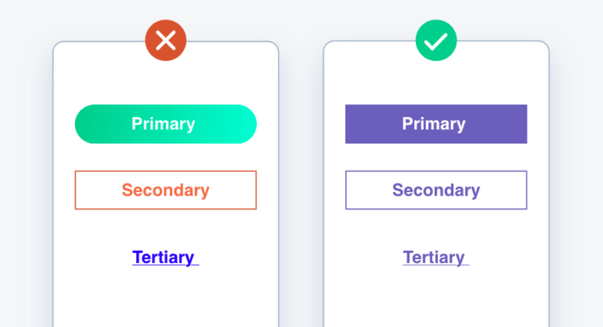
5. Intuitive Buttons
Make your buttons easily discoverable by using clear visual indicators and clear labelling such as size, shape and different colours. Using the familiar rectangular-shaped designs or adding a shadow signifies that this element is clickable. You also often see “submit” coloured in green and “cancel” coloured in red.
It’s also a good practice to place controls where users would expect them to be, or also known as the first Law of Locality. Our eyes naturally wander to the spot where we expect the change to happen. For example, it makes sense to place a button for adding a new item either at the bottom or top of a list.
6. Good Contrast
Designers have many tools at their disposal to create contrast. One way is through variation in colour, size and shape. There should be sufficient contrast between the text and the background to help improve readability for users with visual impairments or colour blindness.
You can also use different sizes of typography and images to draw the attention of users where it matters the most. The same goes for shape. If most elements on your page are rectangular, a circle can effectively highlight important information and make it stand out.
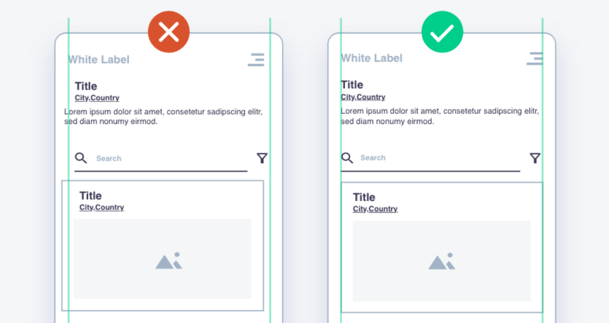
7. Layout
The layout is like glue that holds all other elements together. It might not be obvious to users, but it has a significant impact on navigation and how easy they find what they’re looking for.
There are different aspects including size, spacing, and overall arrangement of the design elements on a page. Make use of informative headings and subheadings to add hierarchy and structure to the text. This can help guide users to what’s important on the screen.
You can use guidelines to make sure all elements are properly aligned:
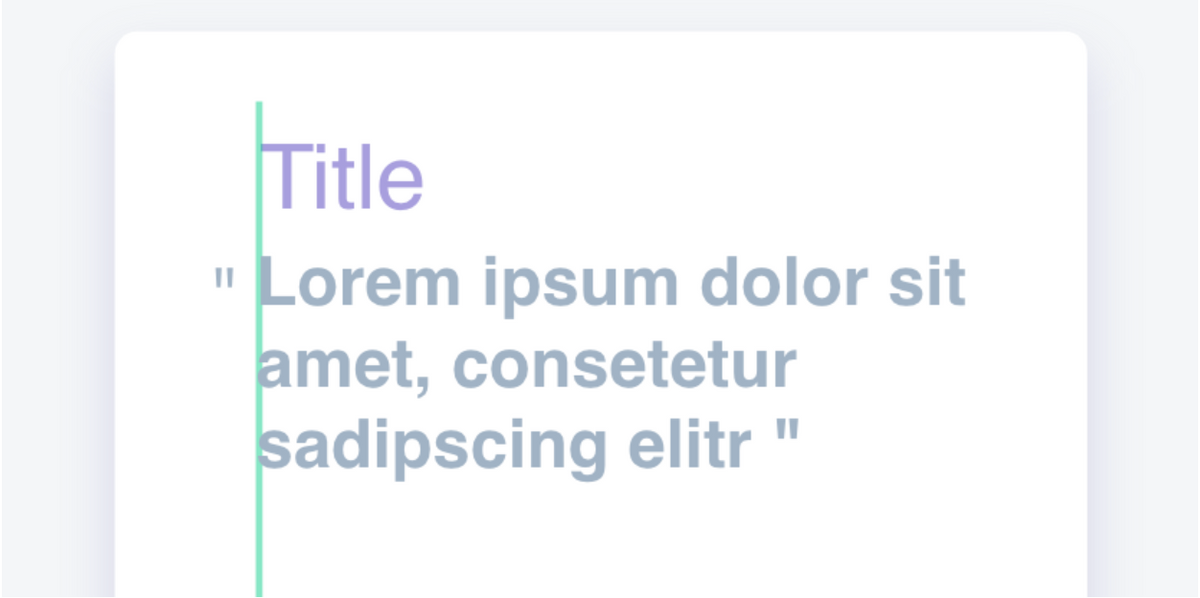
But not everything needs to be in line to be aligned!
Certain elements such as punctuation marks, icons, and bullet points can be left “hanging” to achieve a better-looking design that's easier on the eyes and more intuitive:
8. Simplify Pages
One of the characteristics of a good UX/UI design is simplicity. You don’t need fancy hover effects, heavy shadows, or too many colours to achieve a sophisticated-looking design. On the contrary, unnecessary elements can distract your visitors and hurt their experience with your product. “Less is more” is valid in full force in this case.
Start by building a basic style guide. Consider what typography, how much padding, and what basic elements would look like, and carefully choose a colour palette of three colours. Then you can follow your style guide throughout the system.
9. Inform and guide the user
Combining different elements from typography, imagery, shapes and forms in a masterful way to tell your brand story is all UX design is about. You should establish hierarchies of importance to draw people to a particular place on a page and convey the right message at the right time.
The real challenge is making the user journey comprehensive, yet simple. One way you can do this is by eliminating unnecessary steps. If you’re asking your users to do repetitive tasks like filling in the same information over and over again, this can lead to frustration and less conversions. Consider implementing an auto-filling feature.
If the user journey involves multiple steps, you can also design a linear process. Creating a clear path with well-defined tasks and next steps allows users to get to their end-goal quicker and hassle-free.
10. Plan for the future
With the speed of tech advancement and ever-changing user expectations, even the most well-thought-out interfaces will eventually become outdated. You probably can’t truly future-proof UX & UI. But there are some things you can consider to tackle redundancy and increase longevity of your design.
Make sure your digital product has a fresh and modern look, but don’t get too caught up in trends. Short-term trends might be cool, but they are usually a bad choice from a UX & UI perspective. Stick to the tried-and-true principles to achieve a sustainable design.
We already strongly emphasised the importance of consistency and simplicity. A coherent, easy-to-use design not only improves the user experience, but it also makes room for flexibility. The more complex your design is, the more difficult it becomes to maintain and adapt going forward.
Wrapping up
User experience is critical to the success of any web app and should be given careful consideration at every stage of development. We hope you found our tips helpful and that you’re feeling inspired to take action on improving your web app’s user experience.
If you need a little extra help putting any of these tips into practice, or you want to explore our product design services in more detail - our team would be happy to chat!
Tags

Hagen Ebejer
8th November 2022